
Course:
Identity and Brand Design
Software used:
Adobe Illustrator & Adobe Photoshop
Throughout the course, we completed 3 projects with the goal of practicing the development and implementation of brand positions through graphic design.
Project 1: Personal development campaign
Project 2: Brand development
Project 3: Brand pivot
Project #1
Creating a personal identity campaign
The assignment was to create three promotional posters for ourselves, using traits and attributes we associated with.
This was done by choosing attributes that fell into these three categories:
Own
Aspire
Misconception
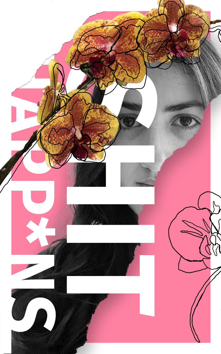
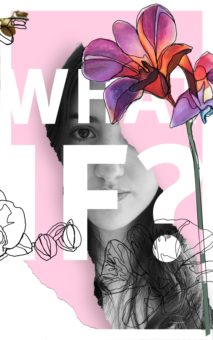
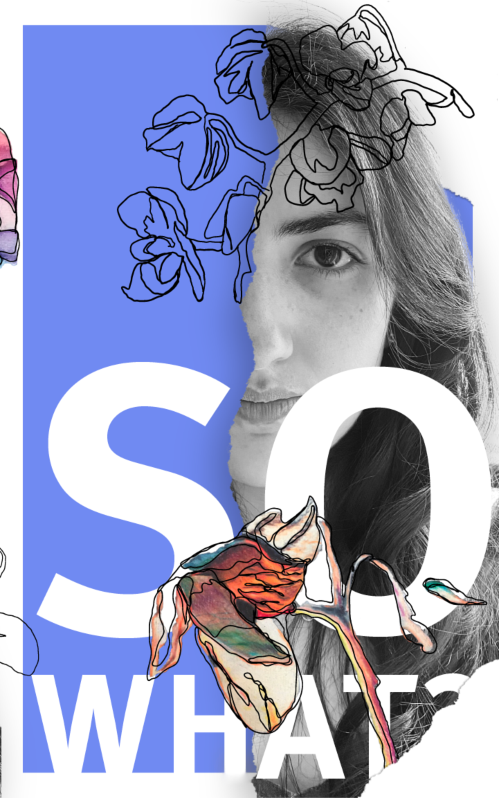
Owned: orchids have fully bloomed to Aspire: orchids are in the process of blooming Misconception: orchids are in the process
symbolize that that is where I am right to symbolize what I aspire to be and all the of dying. They symbolize everything I wish
now. It is also accompanied by the word ways I wish to keep growing as a person. I have to let go of many of the misconceptions
“Shit happens” since that is something always struggle with the idea of “what if?" that I wish did not exist. I chose the
I have recently learned to accept, not and in many situations, the "what ifs" have words “So what?” for this poster since I
everything goes as planned or the way stopped me from doing things and would like to start taking control over
one expects it to go. being myself. many misconceptions.
Project #2
Brand development
The assignment was to connect our original identity campaign to an offering of our invention (a product or service), transforming our personal identity into an outward-facing brand.
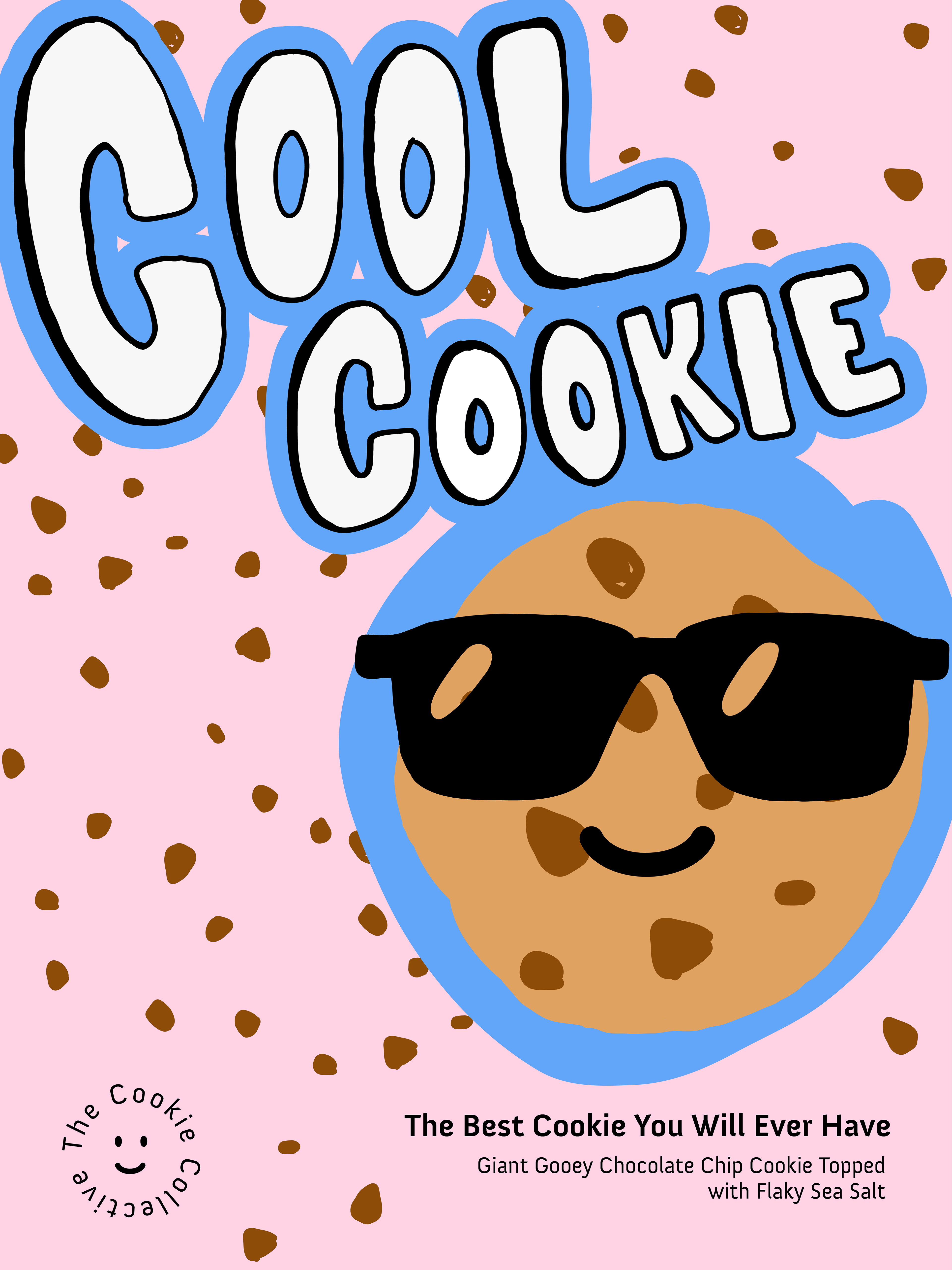
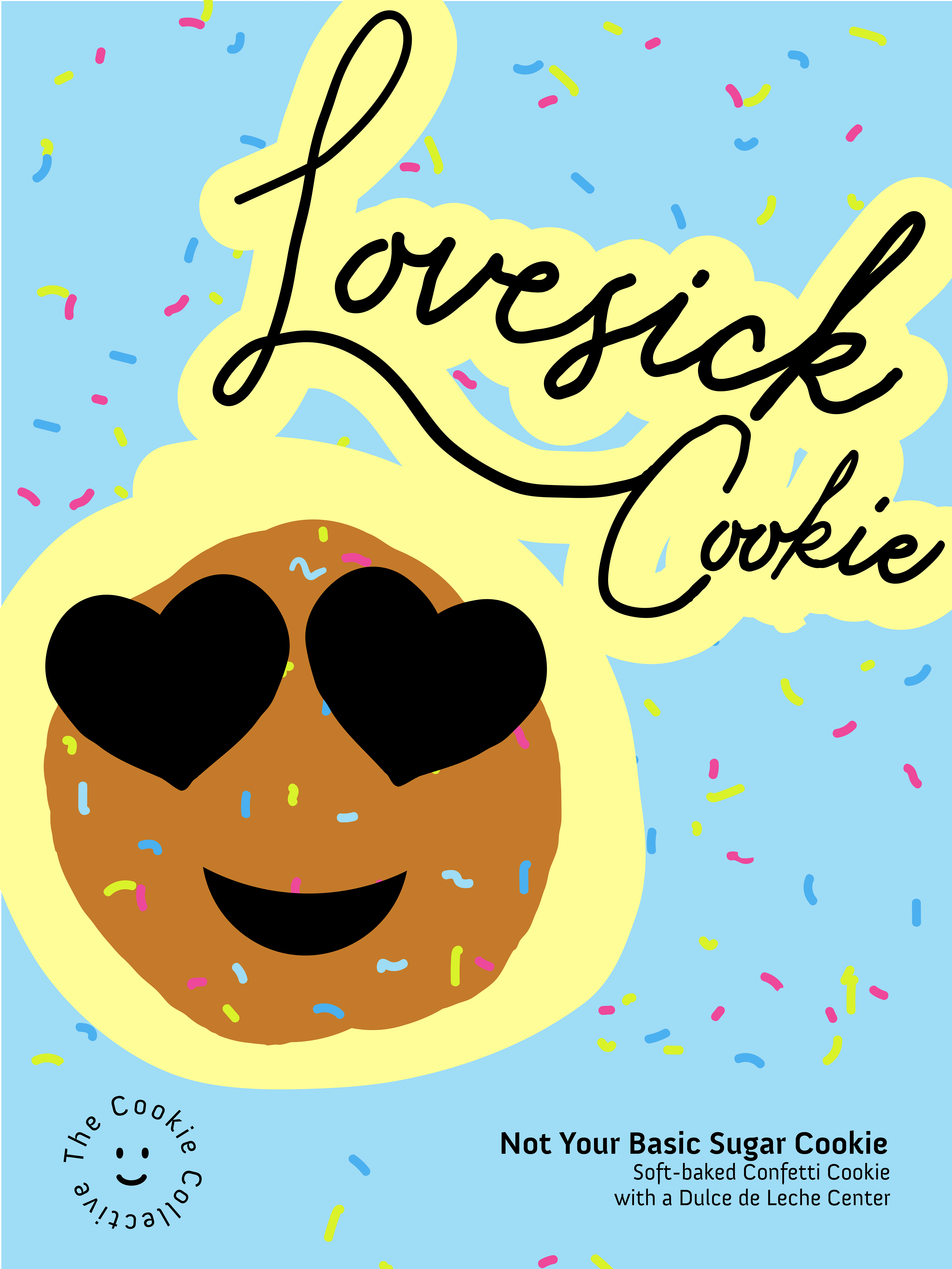
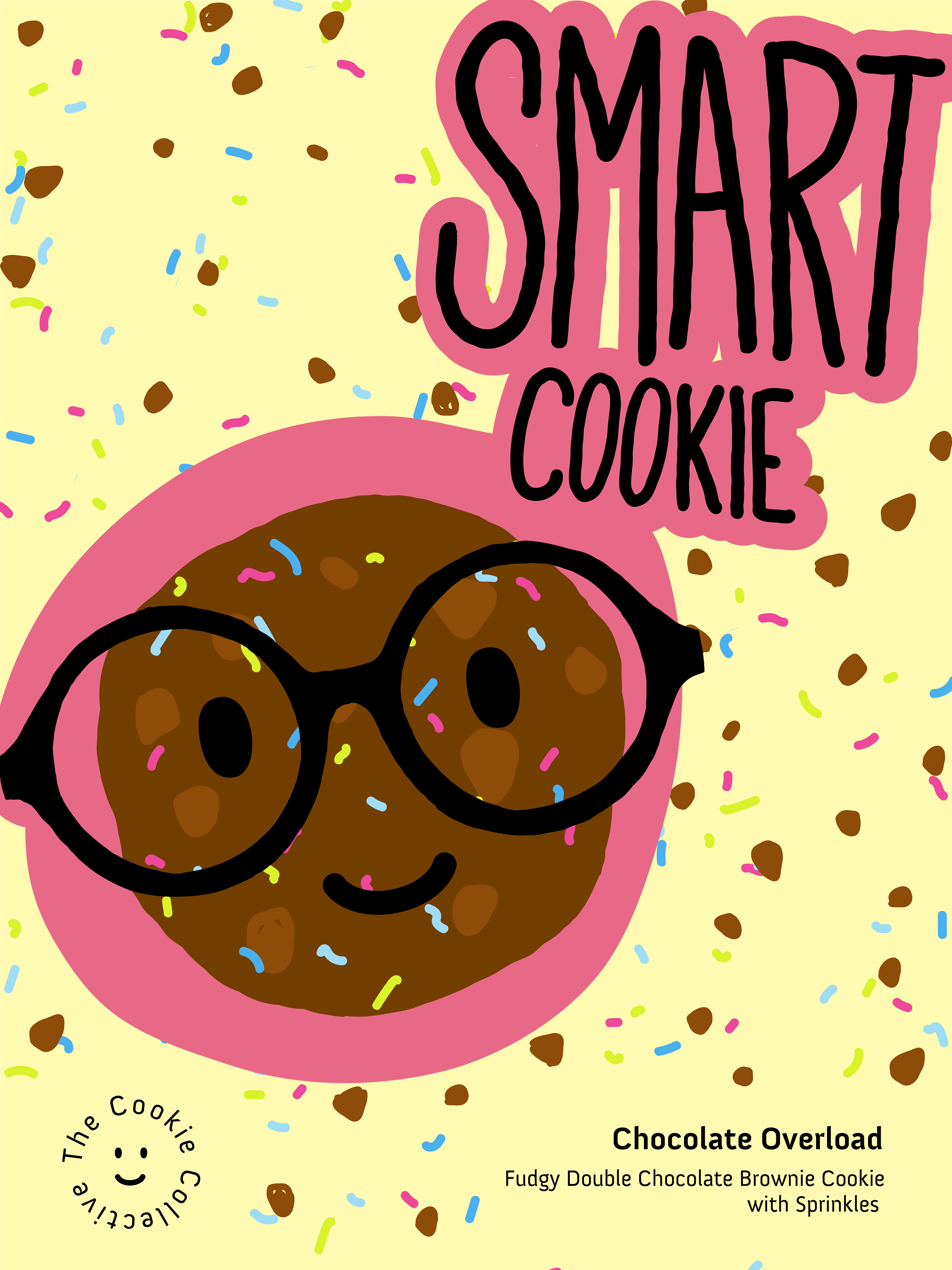
My idea for the project consisted of creating a cookie baking business as, growing up, I always had a passion for baking and experimenting with new ingredients. As I moved away from the personal identity poster to develop these, I faced the challenge of making them more fun, colorful, and being less overall rigid.
The posters are composed of bright yet pastel colors, specifically yellow, blue, and pink. For the cookies, I chose to go with three of the most basic flavors I made as a child: chocolate chip, double chocolate chip, and confetti sugar cookie. Though these could be thought of as basic flavors, they all have a twist like the dulce de leche filling or the flaky sea salt.
Project #3
Brand development
The assignment was to re-align our brand to resonate with a different audience, demographic, or historical moment.
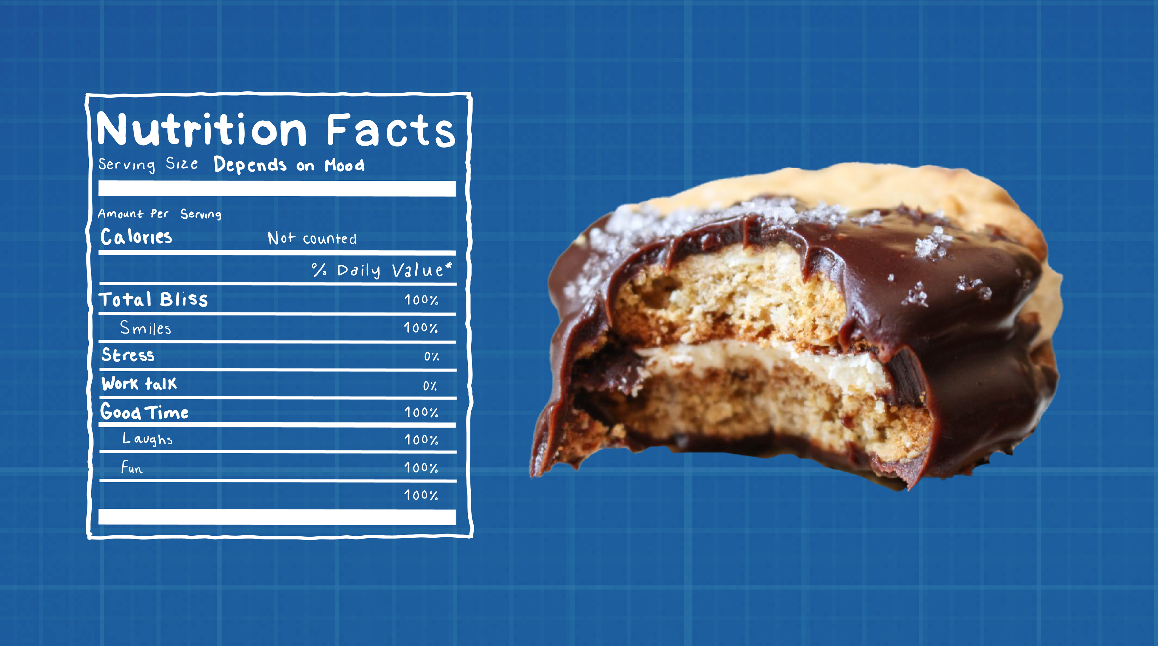
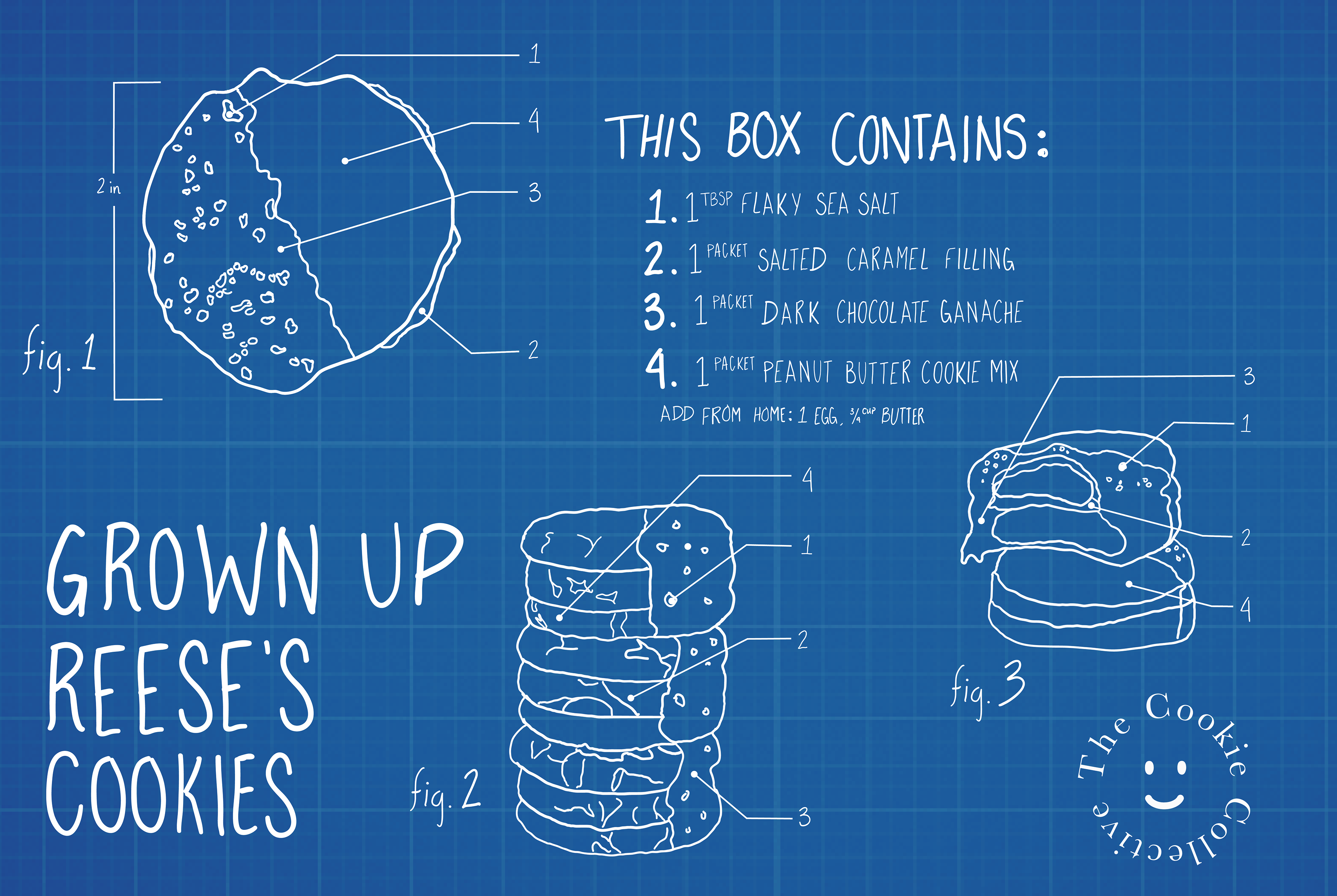
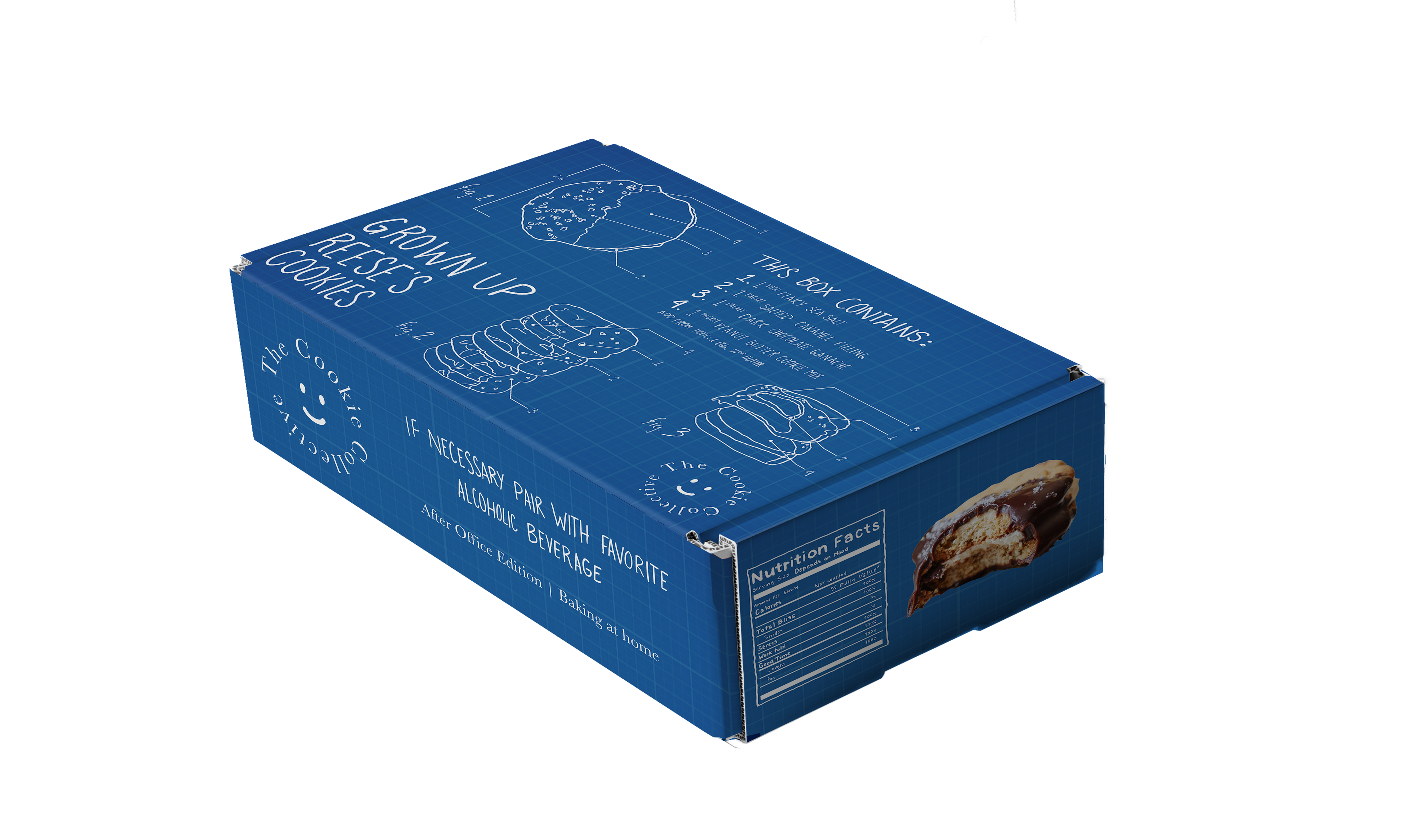
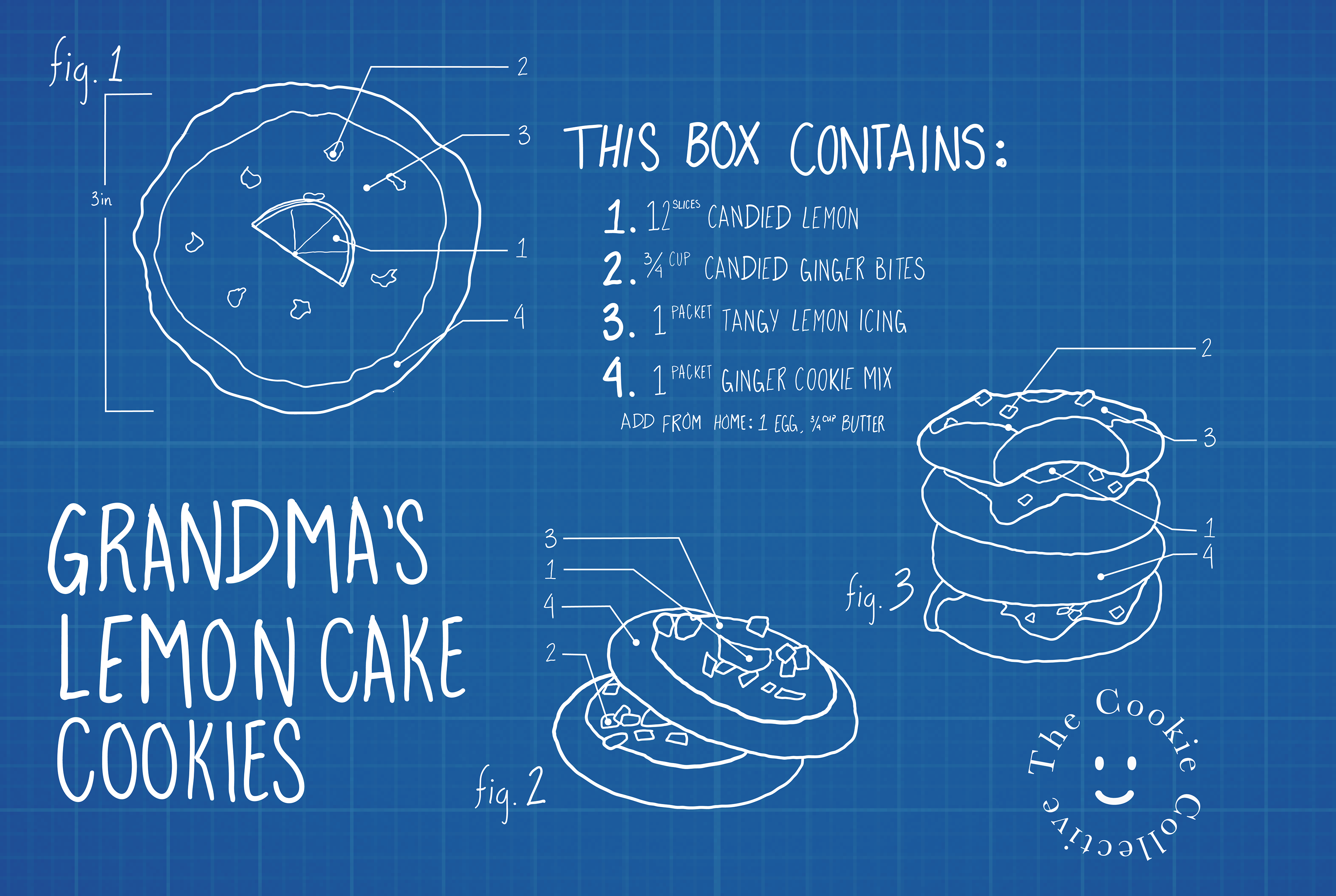
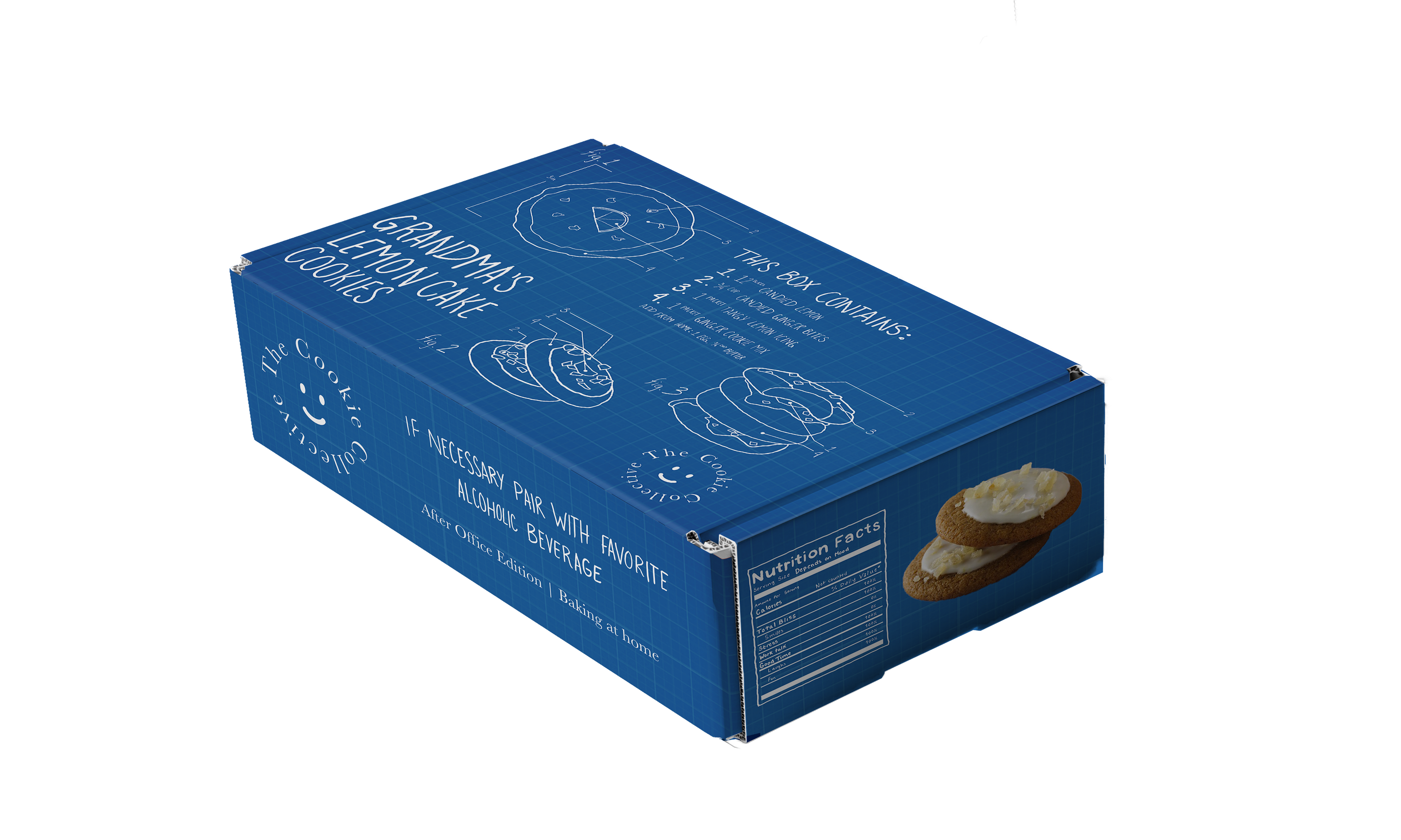

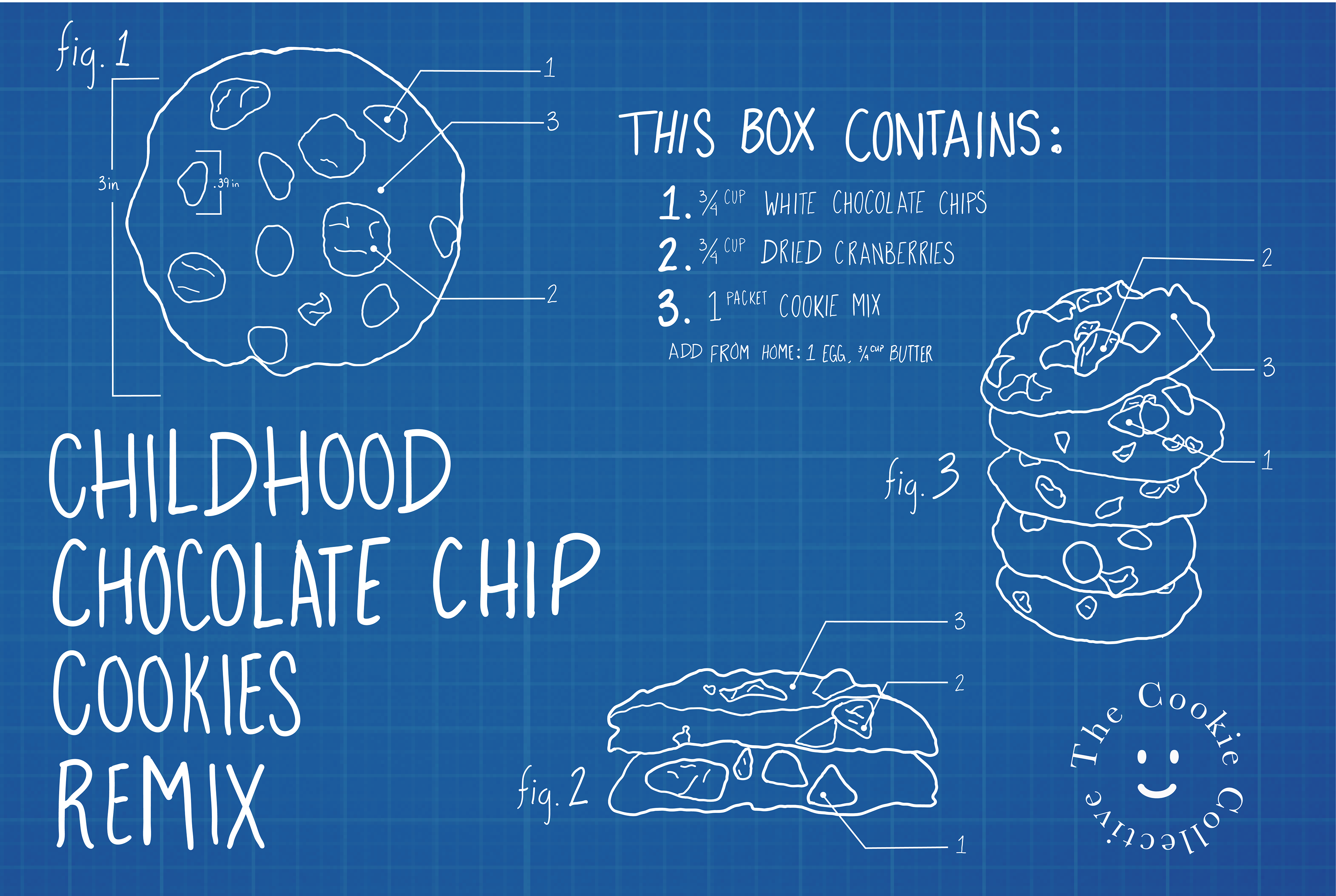

The original cookie selling business did not target any specific group of people rather a broader audience; for the brand pivot, I decided to focus on young adults. The cookie business also changed as it would no longer be a baked cookie business rather a meal subscription box for cookies.
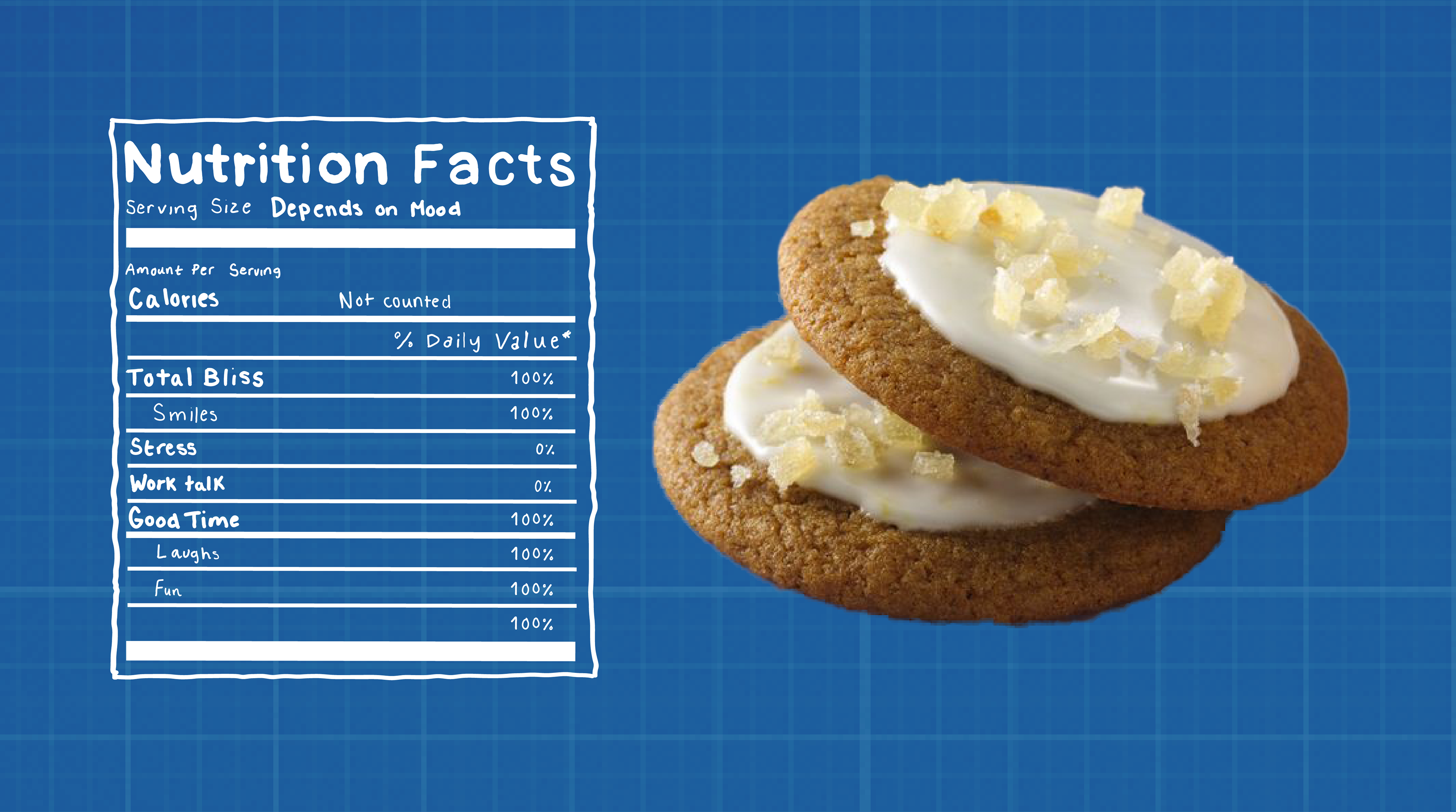
The idea behind the box comes from wanting to be a kid again; it comes in three flavors that take you back to those moments you don’t want to forget. A grown-up version of Reese’s chocolate to make you feel like you are 12 years old, sitting in the car, traveling with your family; a ginger lemon cookie that tastes so similar to your great-grandmother’s lemon pound cake; and a retake on the classic chocolate chip cookie everyone knows and loves. A big difference is also noticeable with the colors used as they change from bright pastels to deep blue with a blueprint pattern.